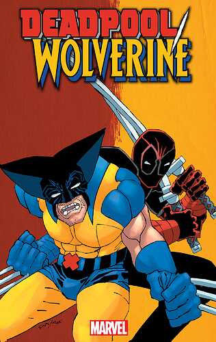
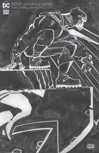
I think that’s one of Miller’s better 2024 covers too, but the colors are doing a lot of heavy lifting.
Fair enough, to each their own. The head looks all misshapen because of the way he drew that helmet and what is with the body? Its growing on the shoulder. Whatever the floating cube things are look like he took a picture of Lego pieces blew them up past blurry cut them out and pasted them on the picture.
Why is the maker showering himself with fruity pebbles?
Just because it’s “better” just tells how bad his other covers have been as of late.
Yes, the cover is “confusing” enough to hide what is actually not that good….

I don’t know…Maybe Miller gets together with Romita Jr and they conspire on how to cheese off CHU users with lousy cover art. They are laughing at us right now!
That’s actually a frightening photo. Yeesh!
I can’t tell if the guy on the right has a red shirt under the sweater or is in need of some series medical attention.
I’m guessing the latter because his left arm appear to be missing, or contorted in an unnatural way behind his buddy.
When the pacemaker blows up it does a lot of damage, but good ol’ Frank…or John… is just laughing it off. What a trooper.
On his way to The Electric Unicorn of course!!
Wow, at least you can bet it isn’t AI. AI would be too embarrassed to create that.
I’'m getting 3rd grade photoshop vibes from it
Ah, Tidal Wave, formerly Bluewater. At one point they had a name that sounded like it had a white supremacist link too (Storm-something) and they quickly fixed that. Such a lazy excuse for a publisher.
Wolverine has two triangle cones coming off his head. This just has to stop. Marvel needs to stop. This is elder abuse.
OK, some of these I defended as being decent enough anmd abstract. This one’s bad.
he gave him a x flat top
The Sabretooth cover is arguably worse.
whats even sadder is he’s only 67 years old.
Looks 92 with the years of severe abuse, but is only 67


