Does he have a mullet?
1 Like
Appears he does. Back when I played lacrosse we made sure the back of our hair curled under the back of our helmets too
no thats his back hairs that he cant see or reach
He can’t see any of his hair…
That’s pretty terrible…
Yeah. I’ve noticed his best work is just character posing covers. Anything that involves action doesn’t look good.
Usually I’m a big fan of Mark Brooks’ stuff but this just seems…off. That right arm looks like an inflatable. The face looks good though
2 Likes
He’s done so much good for comic books, but maybe it is time to retire and enjoy life.
1 Like
It definitely… ummm… errrrrr… “makes an impact” ![]()
1 Like
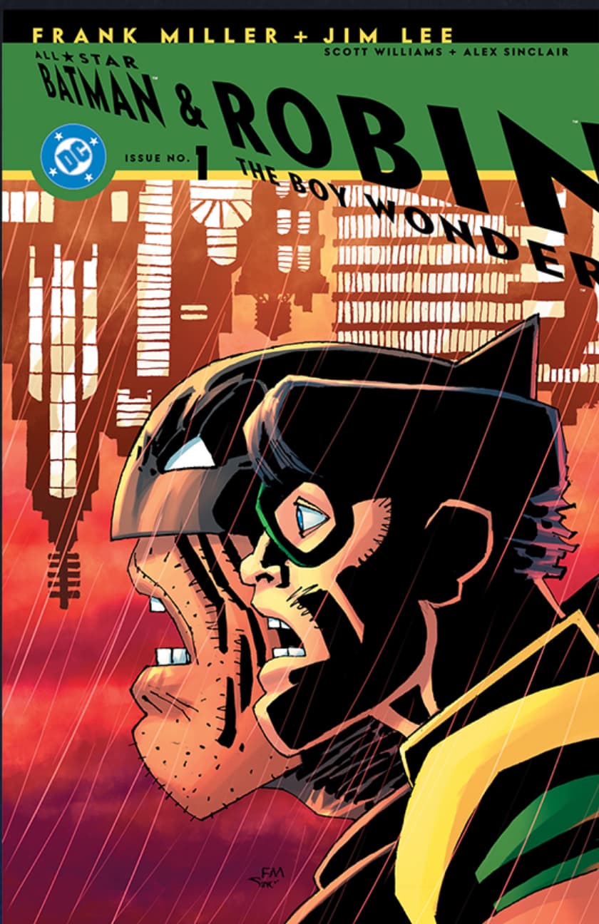
I can appreciate “different” styles of art but this one though… Batman looks like he’s Sloth from the Goonies… not a good look for Bruce there…
1 Like
Of all the covers that came out this year, that is certainly one of them. Frank Miller needs to rest on his laurels.
Definitely going for the Neanderthal look on that one…
1 Like
No matter how much people don’t care for his current art style, it will never take away from his Overall legacy. If Marvel/DC/Others keep giving him cash, he’s going to keep going if he wants to. I can’t image he needs to.
1 Like
It looks way better when you consider they’re both hanging upside down… ![]()
Wonder why they’re opening their mouths upside down…not exactly something I would naturally do…:
I would have never noticed this if you didn’t mention it. I am so fascinated by Batman that everything else was blacked out to me
Its because the buildings are upside down, once they get flipped like that, well, mouths just start opening the wrong way. Facts.
1 Like
Are you referring to Robin apparently being dropped on his head repeatedly to achieve his “flat top”?
2 Likes