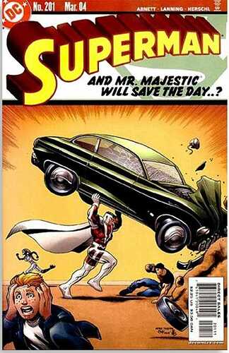
It is nice!
I like it too, and am going to order it, just have a pet peeve about the realism of some of the art. Why have him hang awkwardly on a business sign, which is not meant to support heavy weight or tied down very well (not that I know how this is mounted  ).
).
Small things which mess up great art (impossible poses, missing limbs, weird expressions, etc.), perturb me. And yes, I know this is all fiction, and I understand it looks cool.
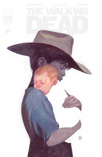
I find some negative space variants a bit meh, but that TWD one is very clever and well-executed 
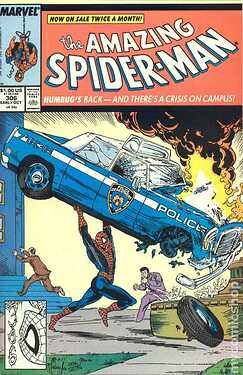
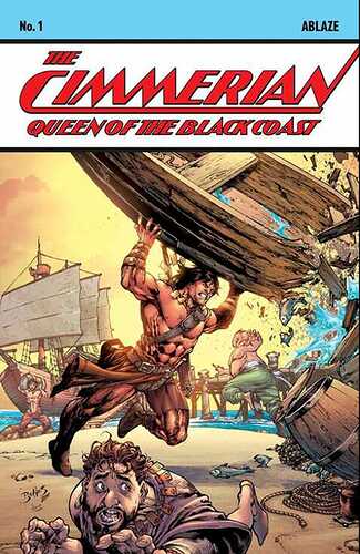
There is a The Cimmerian swipe that does it…do not recall which storyline, but it is closer to the McFarlane one.
marvel series?
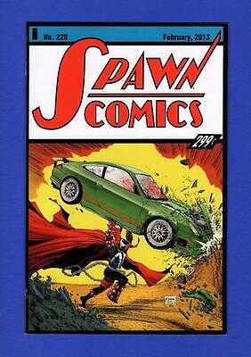
Theres a B&W version of this.
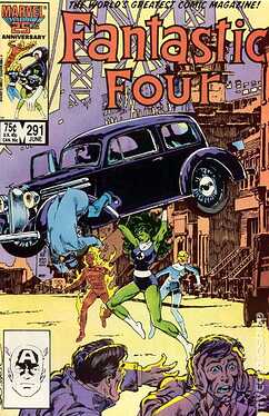
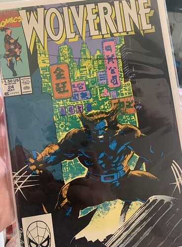
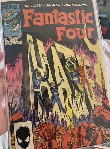
Grabbed these two for a buck each at a garage sale. The Wolverine cover is a classic and well-known, but despite me being very much so anti-hate, I really love this FF cover. This will be a new display book for me. So well done.
Haha agreed, that guy is a bit cheesy
I think its supposed to be superman lol
Agree. Get rid of that fecker. 
This Artgerm cover is great - the other ‘Swimsuit’ covers suck - see the Batman one. Wonder whose brainchild this was.
That is awesome.
