1 Like
The sculpt looks great but the paint isn’t even close to accurate.
1 Like
Yeah, I expected his get up to be darker.
1 Like
There are some figures that need the Gold Label treatment. This is one of them. He needs extra paint on the branches.
Colors look better in the white background promo shots but still off.
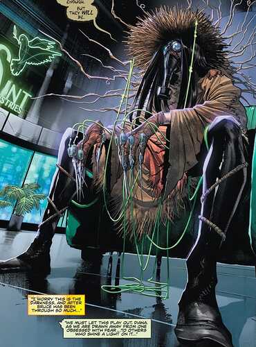
I don’t know where they’re getting the green idea from.
Colors are way off.
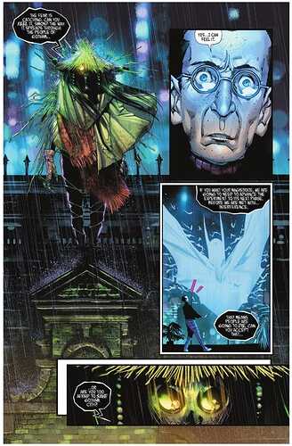
Honestly I think it is from a panel where Scarecrow is being illuminated by a green Saint Industries neon sign.
Odd choice. Good research!
Just bring back classic scarecrow. Costume looks overly complicated.


