I Kringe looking at JRJR’s artwork. Most of it is atrocious and his older stuff has a Micheline Man feel to it.
3 Likes
screams caption me
I actually like it, didn’t order it, but I like it.
![]()
![]()
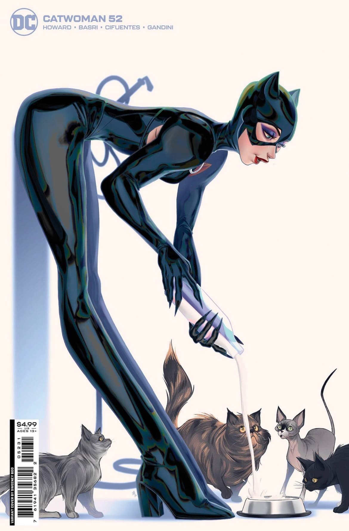
Is she leaning against the wall to pour milk? Lol. I like long legs but that is a little much.
1 Like
Knees double jointed?
1 Like
That milk is going to get everywhere.
Some shorter legs and it’d be a nice cover. The cats look nice but those damn legs!
1 Like
It’s not just the legs… Catwoman’s waist is barely the size of a coffee can and her feet are bigger than her head. The colors are well done and the cats work, but the figure is like an AI bot mixed J. Scott Campbell with Rob Liefeld.
2 Likes
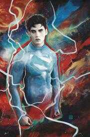
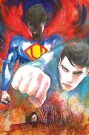
ADVENTURES OF SUPERMAN JON KENT #2 (OF 6) CVR B ZU ORZU CARD STOCK VARIANT
2 Likes
google
andrew dice clay
little boy blue
1 Like
Wow. Issue 1 wasn’t a bad cover. Phoned this one in though.
1 Like
Yea, I’ll say it …
ALEX ROSS 1:100 TIMELESS VARIANTS
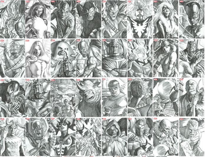
These look soooooooo bad. The colored covers look way better.
3 Likes
They look pretty good to me. I love his artwork so I’m biased.
2 Likes
98% of the time, I don’t like sketch covers. His finished covers are SO SO SO good, but those sketch covers just look, well, unfinished. I love the polished look of his painting. In my book, he’s hall of fame level.
5 Likes
Welp, I told ya these would be shit…and…they are !
Tom King variant covers
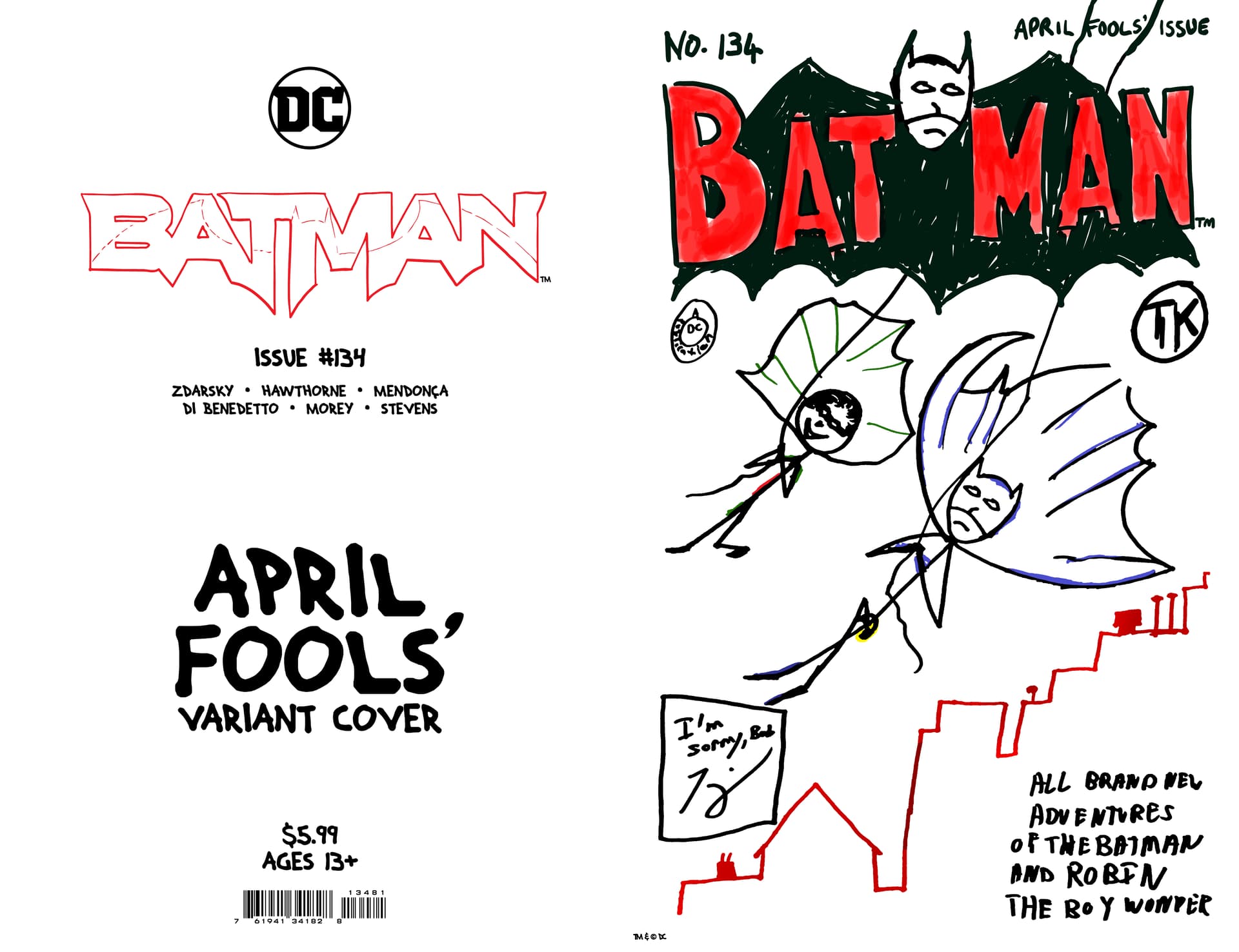
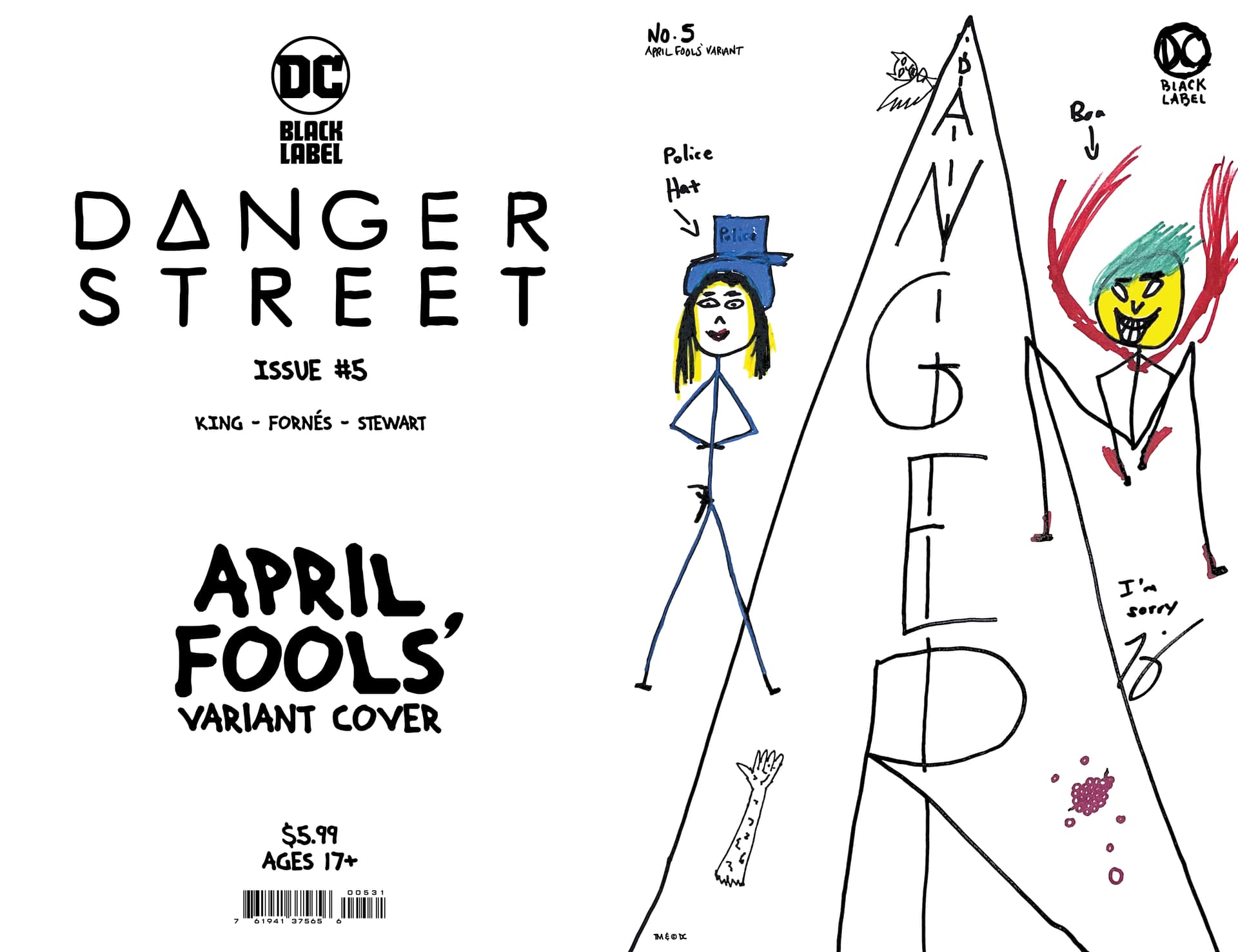
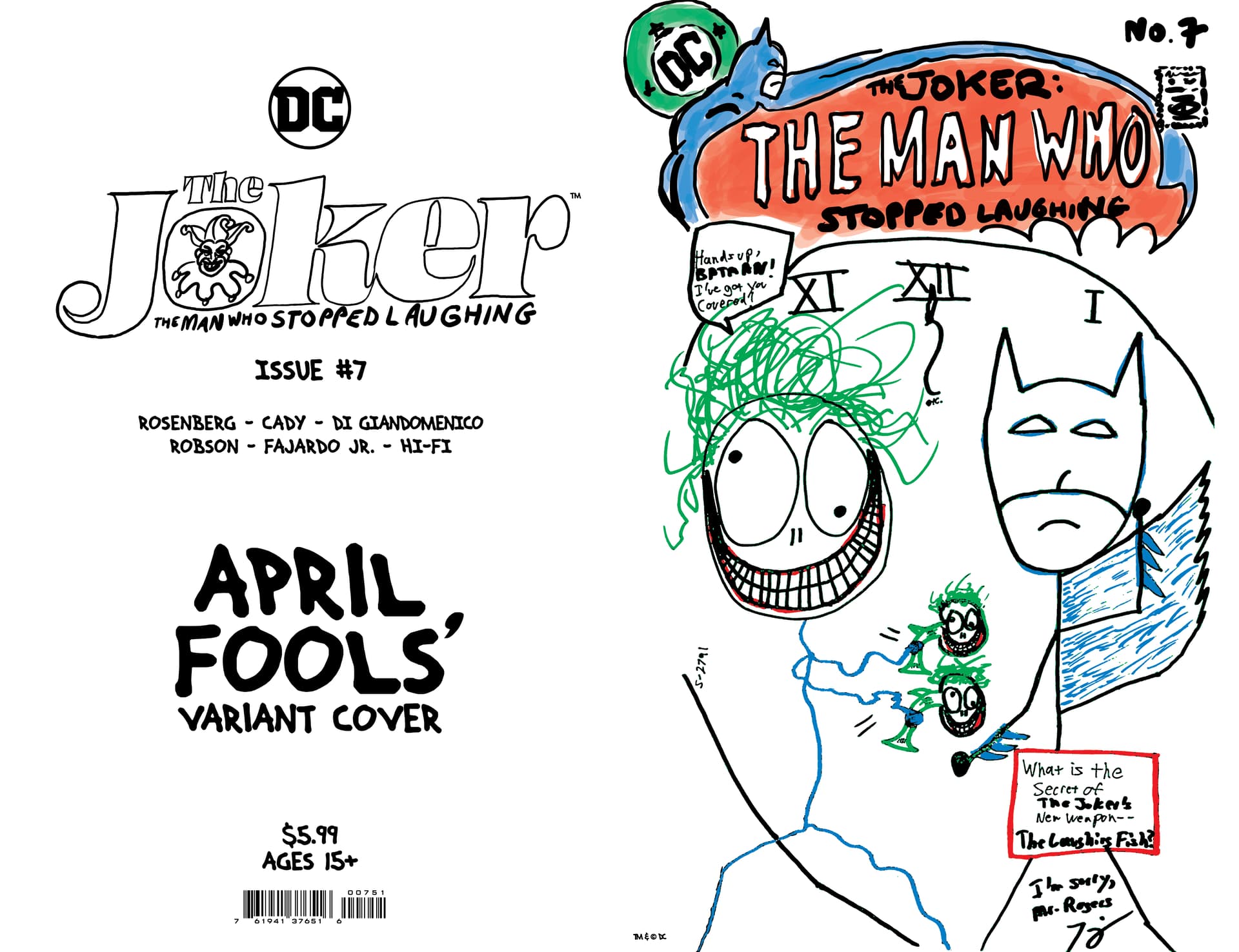
WRITERS ARE NOT ARTISTS !!
1 Like
I mean, they are intentionally bad and an, “April Fools’ Variant Cover,” so I think we have to disqualify these from being the worst cover, honestly. Purposely bad can’t count.
1 Like
You going to pay $5.99 for it ?
1 Like