Good lord, that’s bad.
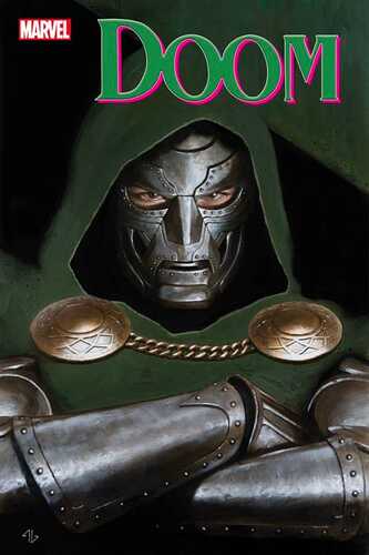
Once again, Marvel’s complete and utter disregard for typography ruins a perfectly good cover. It’s not easy to make an Adi Granov cover look terrible, but Marvel finds a way.
Hopefully they fix the logo before going to print.
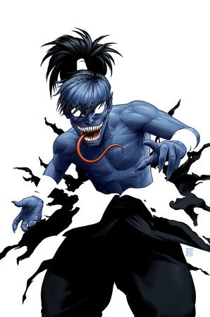
KID VENOM #1 JOHN TYLER CHRISTOPHER VIRGIN NEGATIVE SPACE VARIANT

When did he become Nightcrawler ? BAMF !!
Looks like he exploded.
He’s taking off his weird overalls.
Those pants make it look like a teen’s torso on a bodybuilder’s legs.
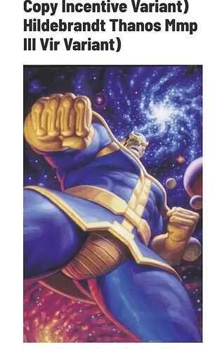
If the personification of Death passes on Thanos I’m sure other folks would be interested in having a fun evening with him!
That poor space prostitute. That’s the last thing she ever saw.
Oh man, Thanos îs doing thirst traps on his social media.
I actually kind of like this ![]() maybe I’m just thirsty for Thanos
maybe I’m just thirsty for Thanos
This needs to become a meme.
Hey-O
Now this is weird and wild. And stuff.
I honestly can’t believe they’re using these for covers. They are Horrible looking !
The Hildenbrant stuff is just dated. I loved their work back in the day.

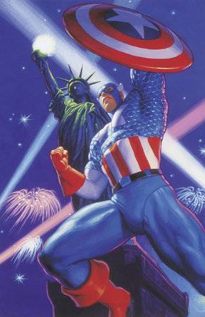
Move over “headshots”….make room for “crotch shots.”
And I do mean make room! Because there isn’t much of it in these tights!
You go Cap! U.SA.!!! U.S.A.!!
America’s ass, and America’s package!
Looks like another Hildebrandt? Is this a coincidence with the Thanos? It would actually be hilarious if there was a whole variant series of crotch shot covers.

