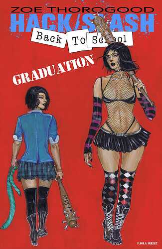
Some indie publishers already do that with lady’s on the cover. A number of covers are quite graphic!
Sex sells
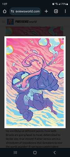
That’s not sexy. Looks like a high school art class picture.
I would say thats bad photoshop…even though its not
I just had a regular who gets all the Hack Slash covers have me order the ratio. He also gets a lot of stuff like the Zombie Tramp type nudes. If I get some stuff in I don’t want to put on the website or risk the wrath of E-Bay enforcers with, he takes it all.
Hack/Slash always is a fun read.
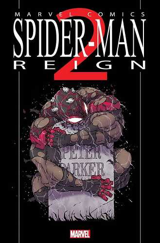
Looks like Miles hulked out.
or… or… Did Hulk miles out?
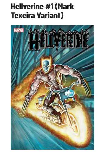
Weird, it almost looks like a mix of a xenomorph and venom’s face. But yeah, this is bad lol
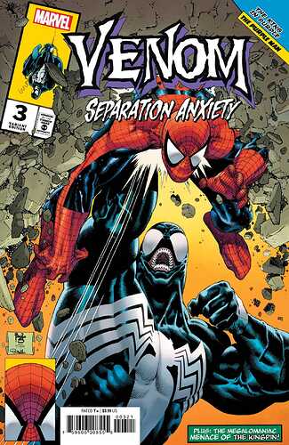
Dare I say that I actually miss that stupid tongue?
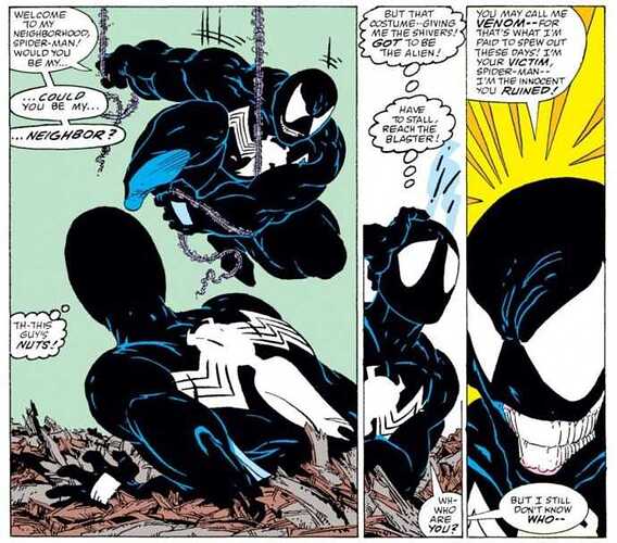
tell me you never seen mcfarlanes version of venom in asm 300 without telling me
It’s been so long since I’ve flipped through that book, I have no idea what you’re eluding to.
So…did I just satisfy your challenge? ![]()
I think it’s a reference to how the earliest appearances of venom don’t have any tongue in the head so it looks a little weird with it just being a big mouth. Erik Larsen introduced the tongue so to speak.
The mouth on Mcfarlane’s Venom is a lot bigger and more formed. The one for that #3, the mouth looks sinked in and smaller. Thats why it looks off. Well at least to me.

