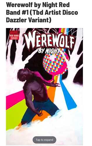
Rose Besch is such a polarizing artist for me. Love some of her covers but hate others…like this one.
i can see the 1:100 having a larger print run than the trade dress besch cover
oofa… even using the phrase “beauty is in the eye of the beholder” is a tough one to apply to that Besch cover. What a friggin mess
Idk, I’ve seen a lot worse. It’s kinda cute in a “My Little Pony” way. Or even a Skottie Young inspired baby variant?
i do see now a nirvana homage
And now I see it too! I wonder if it was inspired by it?
I like the idea of the cover but seems like they didn’t really execute it to make it work…
It feels unfinished. Almost like they just photoshopped WWBN into that image. Agree, howling at the disco light could have been a cool idea…they just missed the mark badly imo.
I feel bad. I know he is trying and still needs to make a living but they can be bad.
WWBN looks very confused…like he was just transported from the Stone Age into a night club of the 80s….
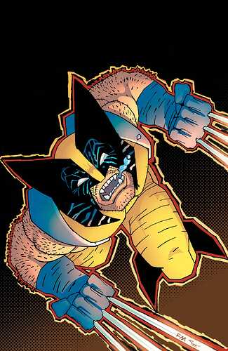
It’s better than his Ghost Rider/Wolverine cover from earlier this year. Still, when you look at what he’s capable of but chooses not to do, it’s sad.
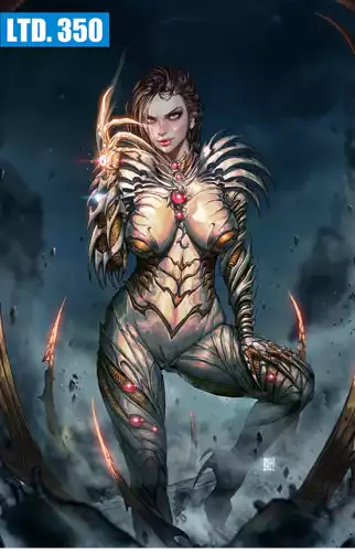
That is just wow… should have been limited to 1
She needs a good bra.
Eom’s Vampi covers were awesome
The Witchblade does not help with gravity.
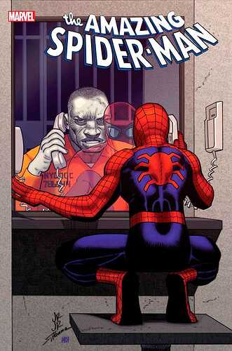
I’m just not a fan of JRJR’s work and they really need get a new cover artist for the Cover A primary covers to represent this title… this one is just meh all over… I think the piss poor job of Spidey’s reflection in the apparent glass is just horrid…
I can’t read the series because of the art.


