It gets worse supposedly its a stephen platt
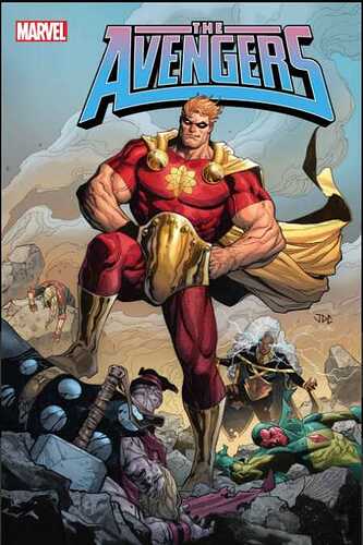
Those are quite the neck tendons…
The worst is how the measurements on the right do not match the numbers on the left.
Look at those hands! ![]()
Kinda looks like his signature. Hopefully it is not finished art.
People love Platt’s details but he struggles with anatomy, especially too-long necks.
Not really a bad cover because of the quality, I actually like Cassara alot, but what is up with the overcompensation and hand placement?
Who is that…Endowment Man?
That’s got my vote for the most terrible cover not only for this year but since comics have been printed…
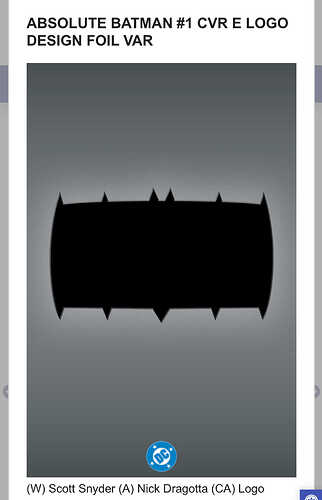
Whoever thought that Batman logo was okay should be fired… And if Dragotta designed it… ughh, I love his work but someone is being too nice in not telling him this logo is plain fscking awful!
There has to be a reason within the story to explain the design. Not saying it will make sense or justify the odd look.
I think Cassara is one of Marvel’s best, but I hadn’t noticed the hand placement because I was too busy studying how tiny Hyperion’s head is.
I though he was hiding his hands behind a fanny pack…
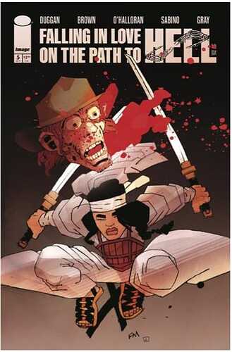
She killed a poorly drawn version of Rick Grimes.
First thing that popped into my head was that it looks like Freddy Kruger’s head lol.
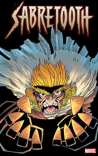
Another sigh from Miller. I’m glad he’s still with us, but feel for these colorists trying so hard to add depth.
I kinda like that one. It has a Sin City style to it.
That’s what I thought too. Some still like his stuff. I guess these covers are for those people.
