It definitely… ummm… errrrrr… “makes an impact” ![]()
1 Like
I can appreciate “different” styles of art but this one though… Batman looks like he’s Sloth from the Goonies… not a good look for Bruce there…
1 Like
Of all the covers that came out this year, that is certainly one of them. Frank Miller needs to rest on his laurels.
Definitely going for the Neanderthal look on that one…
1 Like
No matter how much people don’t care for his current art style, it will never take away from his Overall legacy. If Marvel/DC/Others keep giving him cash, he’s going to keep going if he wants to. I can’t image he needs to.
1 Like
It looks way better when you consider they’re both hanging upside down… ![]()
Wonder why they’re opening their mouths upside down…not exactly something I would naturally do…:
I would have never noticed this if you didn’t mention it. I am so fascinated by Batman that everything else was blacked out to me
Its because the buildings are upside down, once they get flipped like that, well, mouths just start opening the wrong way. Facts.
1 Like
Are you referring to Robin apparently being dropped on his head repeatedly to achieve his “flat top”?
2 Likes
isnt this like a 20 year old title ?
2 Likes
Yeah. A new printing? Odd.
1 Like
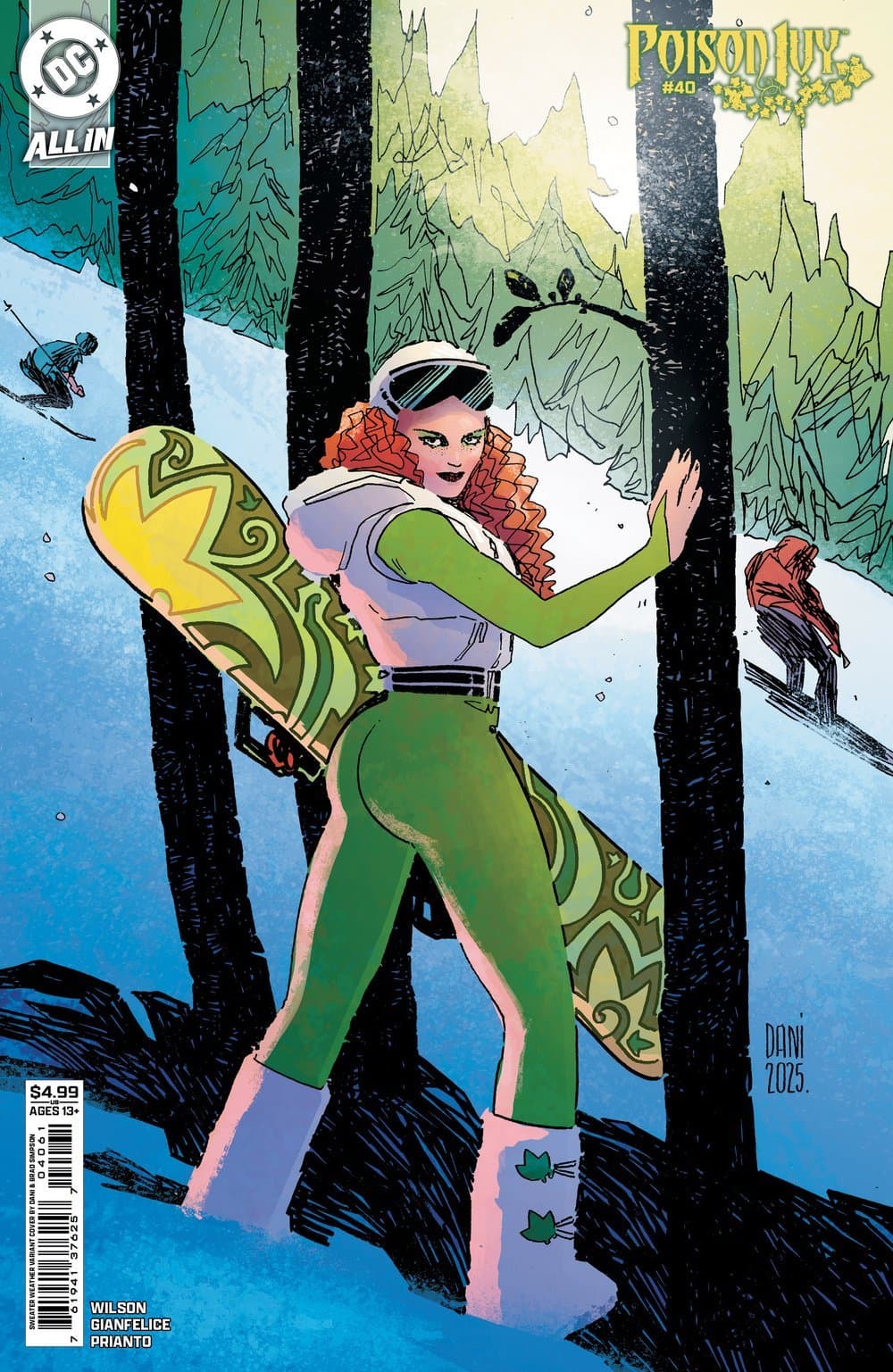
That butt looks like something out of The Simpsons
Poison Ivy is thicc
1 Like
its winter weight dont judge
1 Like
1 Like
All the worst covers you find now belong in the new Worst Covers of 2026 topic! Happy Worst Cover posting…
1 Like