if you where to pick superman spider man cross over covers which would u get ? 1st on dc side
I am getting the Hughes cover
My favorite is the Rafa Sandoval. Del Otto has a mass appeal vibe to it.
Wow that’s a lot of covers.
None of these speak to me. No Middlteton, Mora, or Putri
Not that they would have done better…but at least I’d consider grabbing one. Hard pass for me on these.
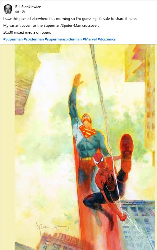
I can’t find this one listed anywhere but apparently Bill Sienkiewicz has a variant cover but don’t know if it is the DC/Marvel version or the Marvel/DC one. I am a fan of his so I would likely grab a copy if it is indeed available.
1 Like
Funnily enough, there actually is a Middleton:
I agree, though, a lot of these covers are “fine” but not $9-worthy.
My personal pick may be the Janin:
With so many covers, it may be worth looking at up-and-coming artists on characters with strong followings – the David Talaski and Jeff Spokes covers. These might be ordered in fewer numbers than the Lee/Campbell/Dell Otto/Artgerm/Hughes popular picks.
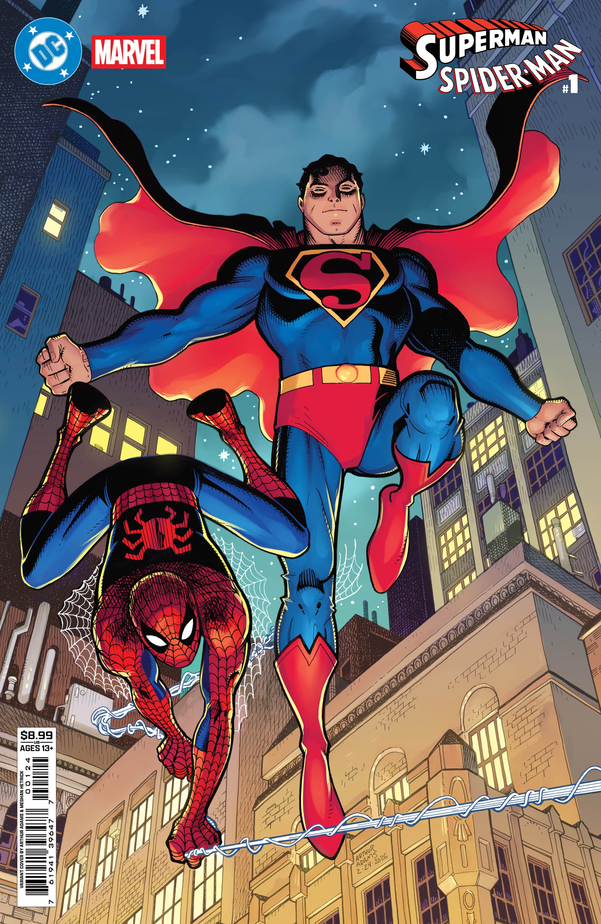
Dark horse – Arthur Adams, a big name, but no cover reveal just yet.
Didn’t catch that (obviously) but the cover didn’t catch my eye either. Bleh.
1 Like
Spidey looks great. If the cover had been nothing but Spidey, it’d be a winner.
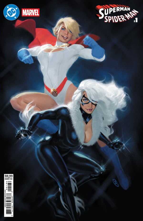
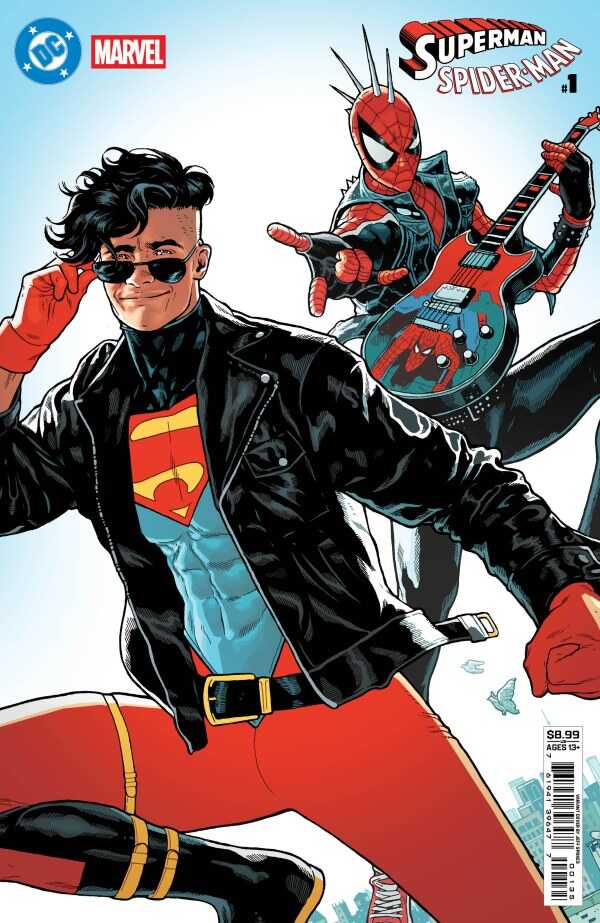
I think with these high cover prices and so many covers, this might be the strongest argument yet for “buy what you like.” I do think the Power Girl/Black Cat and Superboy/Spider-Punk covers are good bets but will take a few years for demand to build.
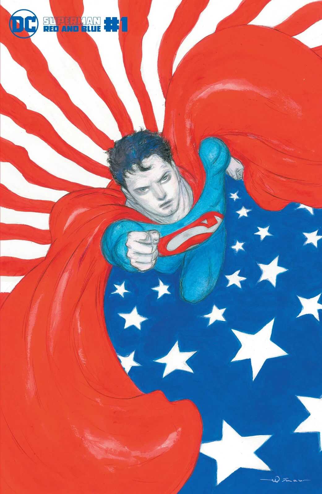
Did he borrow his toddler daughters cape too? What’s up with the S logo? Looks like a knockoff you’d find at Dollar Tree. And what’s up with the tights being a little “loose” around the knees? And why’s he posing like that with arms out and knee up? This has got to be the most horrible Superman ever drawn…
Not his best work for sure.
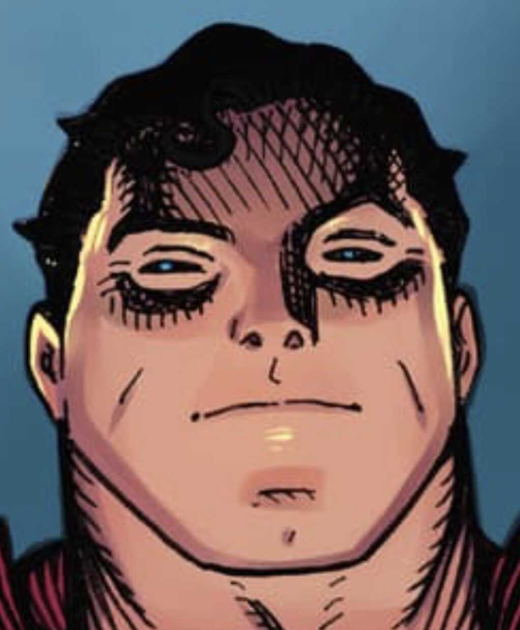
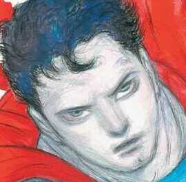
Here is my non professional take on the drawing.
Superman’s chest logo looks like if it was placed on top of the chest instead of it being part of the suit. I like the retro style to it. But it doesn’t fit the looks.
Spiderman looks like he is balancing himself on the web string. And whether you’re a male or female, if your doing a hand stand, you are showing booty curves. No and ifs or butts lol. See what I did there lol.
Those are intentional to me though… I actually like them better…
It’s a weak Superman and shows that even a GOAT like Adams is human, but this is not better…
Maybe they were going for a bizarre bizzaro Superman. Like squared.
No nose….slinky for hair. Ok.