This has got to be a low print run. I only saw 1 copy on the shelf at two local comic shops, and it was just cover A.
Yeah man, I had to preorder that one. It just grabbed me!
Similar to that stupid a$$ Dept of Truth “Baby on a Plate” cover, it’s unnecessary to use children for a cheap laugh/thrill. The Joker is a straight up comic book MURDERER so the idea of putting a scared child on his lap in a Robin costume is sad (regardless that it’s extremely well drawn). I get it, it’s art and art is subjective to all opinions.
Have Joker sitting on the chair in that costume looking straight at us and it would have been a perfect.
Just my opinion. Buy what you want.
Comic books are fiction. They are not real. All the talk on this site about Dylan Brock (a child) and Normie Osborne (a child) hanging out with their serial murdering father and grandfather, respectively. Hmmm ![]()
I agree. It’s intended to be an ironic joke…which aligns with the character being the joker. Especially given his obsession with Robins. Classic kid crying on Santa’s lap, with a little twist.
It’s not real, and it’s pretty tame relative to what situations children are placed in within the contents of comic book stories.
But I do appreciate the different perspective as it didn’t even occur to me someone would see in that way.
I think it has the potential of becoming a classic cover that years from now will still be talked about. Just my 2 cents.
It’s like a Satanic Hallmark card.
At least since the early 80s sermons on baby eating satanists has been common sermons in the USA. The cover references a real world conspiracy theory. The book is about conspiracy theories…
Taking offense at a fictional character is nuts.
Somebody better tell all the people mad about the Punisher logo, lmfao.
I hear you, and then I remembered that one time I yeeted a book across the room because… you know, feelings ![]()
![]()
![]()
[EDIT] Book in question: Joe Hill’s “Horns” (BTW, decent book… shitty movie)
The people who don’t like that logo, don’t like it because sociopaths have appropriated the image. Its the sociopaths who have adopted the logo that they don’t like, not the actual logo. Its a real world issue, and not one contained in the books as a fictional story.
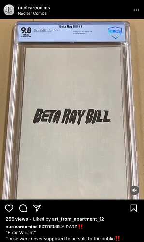
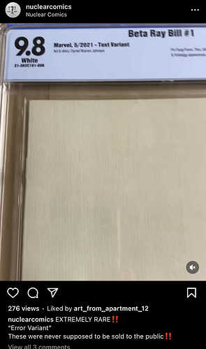
Another fine Mess by a grading company, this time by CBCS.
It’s just the inside of a store exclusive cover. Yikes. This is the same exact thing that was the ‘timeline’ variant, when it was just a high republic without the cover graded by CGC.
Well, it does what it says.
Why would the inside of a store exclusive cover be different than any other variant or cover A? It’s only the outside cover that’s different.
Unfortunately I don’t think I have a copy of this book in any form to confirm.
Idk but that’s how they do them sometimes. Have you ever read a store exclusive marvel comic? It’s extremely common that they (Marvel) do this for whatever reason. It’s usually just like that, same exact background color and usually just the title of the series.


