That’s the only way to rock a thong… 
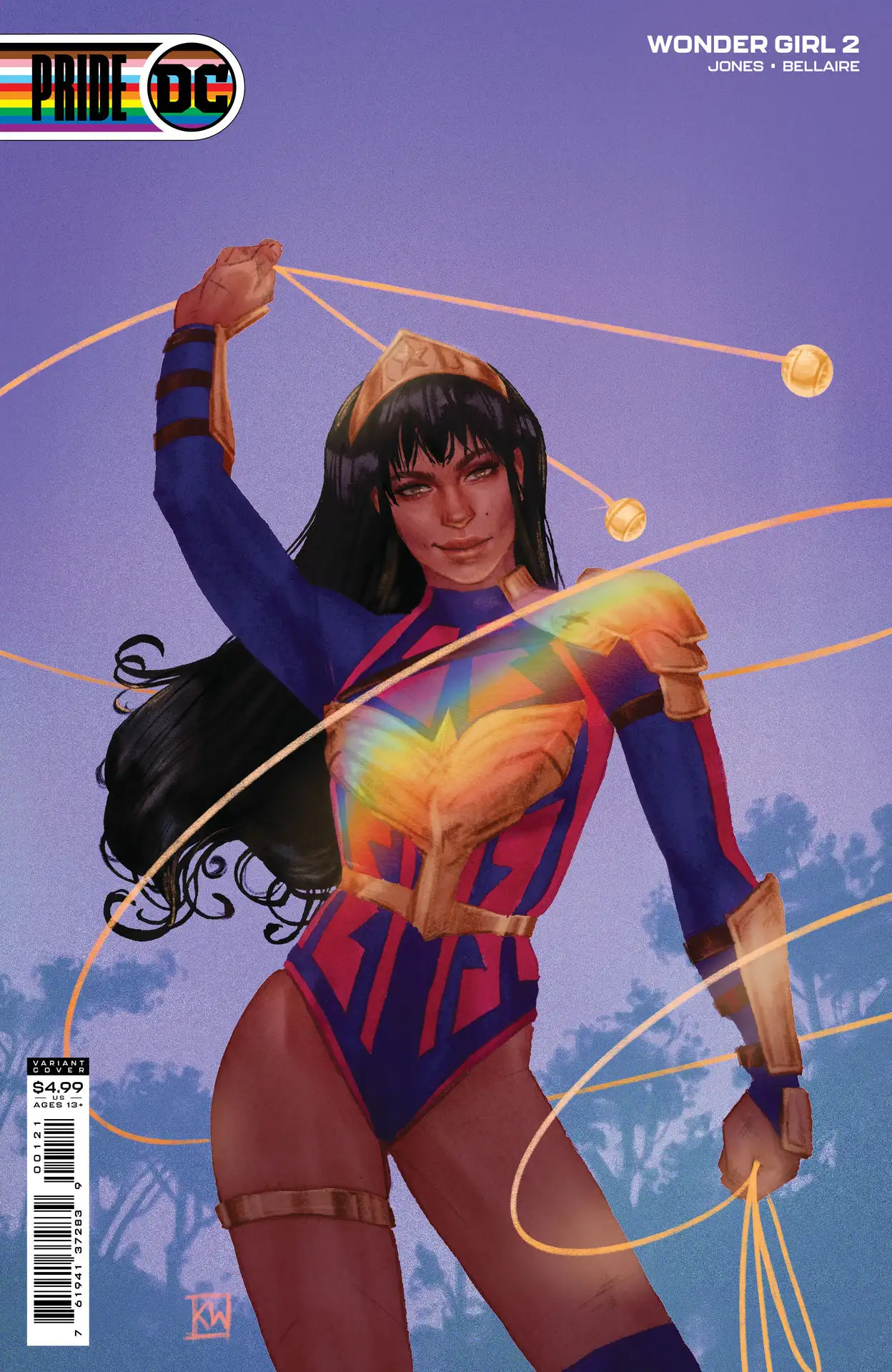
I kinda like it.
1 Like
Need more definition in her left leg. This cover ruins my immersion.
1 Like
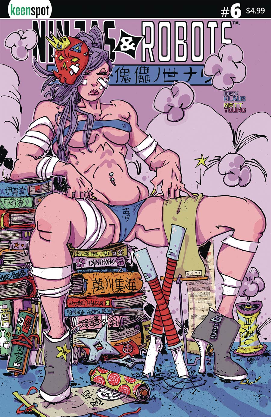
Reminds me of some of those 70’s and 80’s underground comix. Strong, “Horny Biker Sluts,” vibes from it. Yes, that was a real underground comic. Had very tough and strong-looking ladies.
2 Likes
Dollar bin for sure. Could possibly be a pride issue.
Hard day of dumpster diving.
That’s hideous.
Please do, tell me more… you caught my interest… 
you might want to google david choe
I actually like the underground comix look of this style. very retro 70’s
I might take some heat from you guys on this one, but I audibly cringed at this.
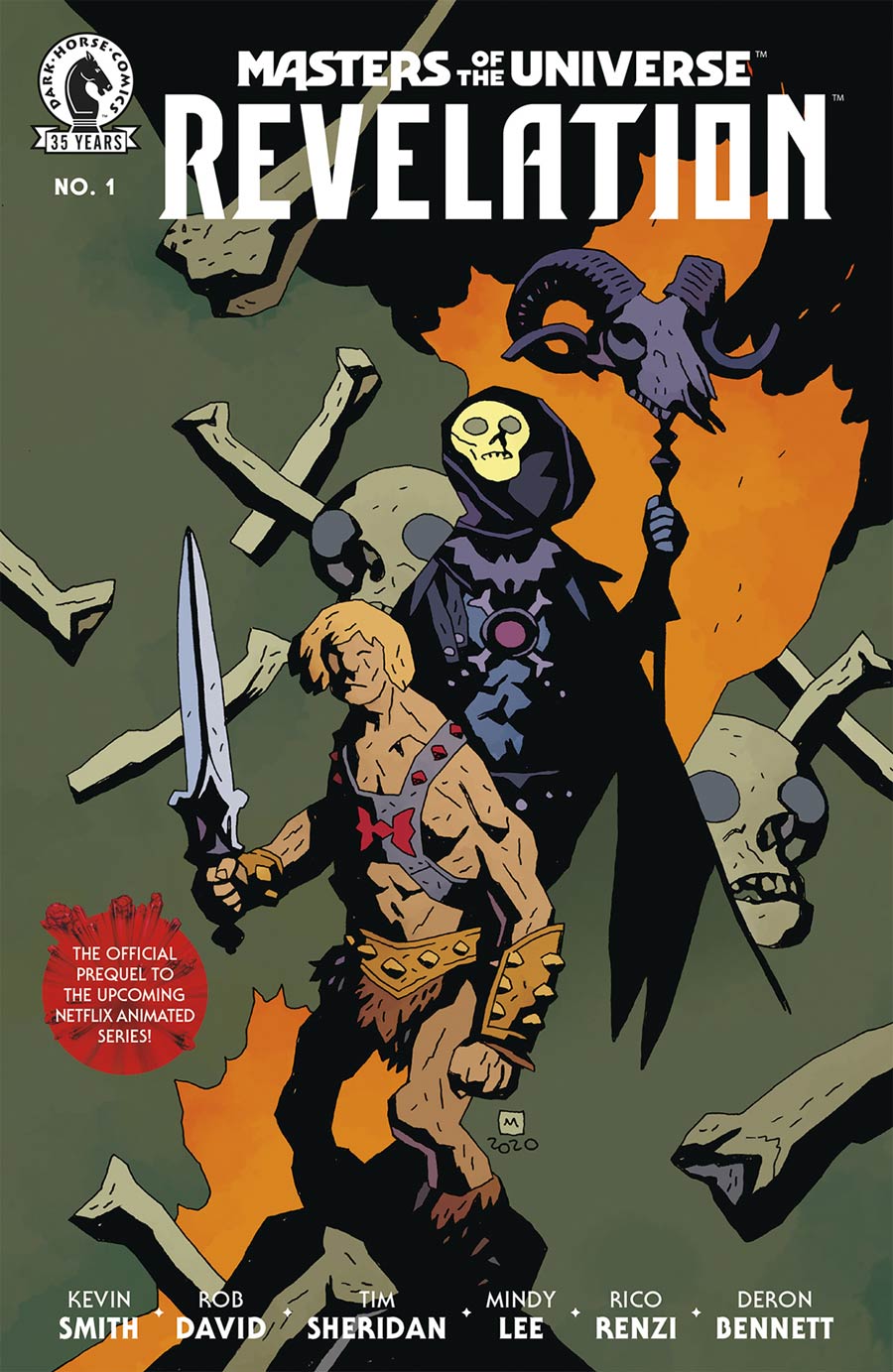
I get that it’s the ultimate distillation of Mignola’s style, but… he can do better than this. Look at He-Man’s left knee. I also dislike how no one ever gets shoulders from Mignola anymore, either.
4 Likes
He was probably tripping on shrooms!
You know you love it!
If you look up the series or John Howard you can find his work on, “Horny Biker Sluts.” Issues aren’t too hard to find later printings or collections of compared to some stuff. With underground comix, those early printings can be costly but later ones aren’t bad with some books having been reprinted many times. For more on Underground comix, I always recommend Fogel’s Price Guide. It’s due for an update, though, since the latest big collection. Comixjoint will tell you a lot too.
2 Likes
No, I wanted these as real women…
Trying to play art critic here, but maybe there’s a meta commentary here. Because I can’t help but think the style has to be intentional, I think the artist is probably trying to communicate that Superman is such an iconic staple of popular culture that he’s recognizable in the most abstract form just by using his colors.
Having said that, some sort of high brow meta commentary is not what the comic market wants or appreciates, so it was a poor decision.
This is all assuming the style was intentional and the message I’m inferring was what was intended. If not, this just sucks.
I agree. He-man looks like a good wind could blow him over.
I’ll take “what happens when you don’t feed cartoon characters for $1000”, Alex.
2 Likes