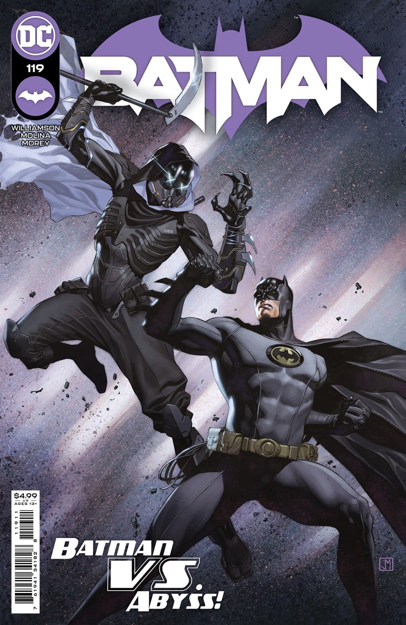
New writer. New artist. New story arc and a new villain called ABYSS!
First appearance:
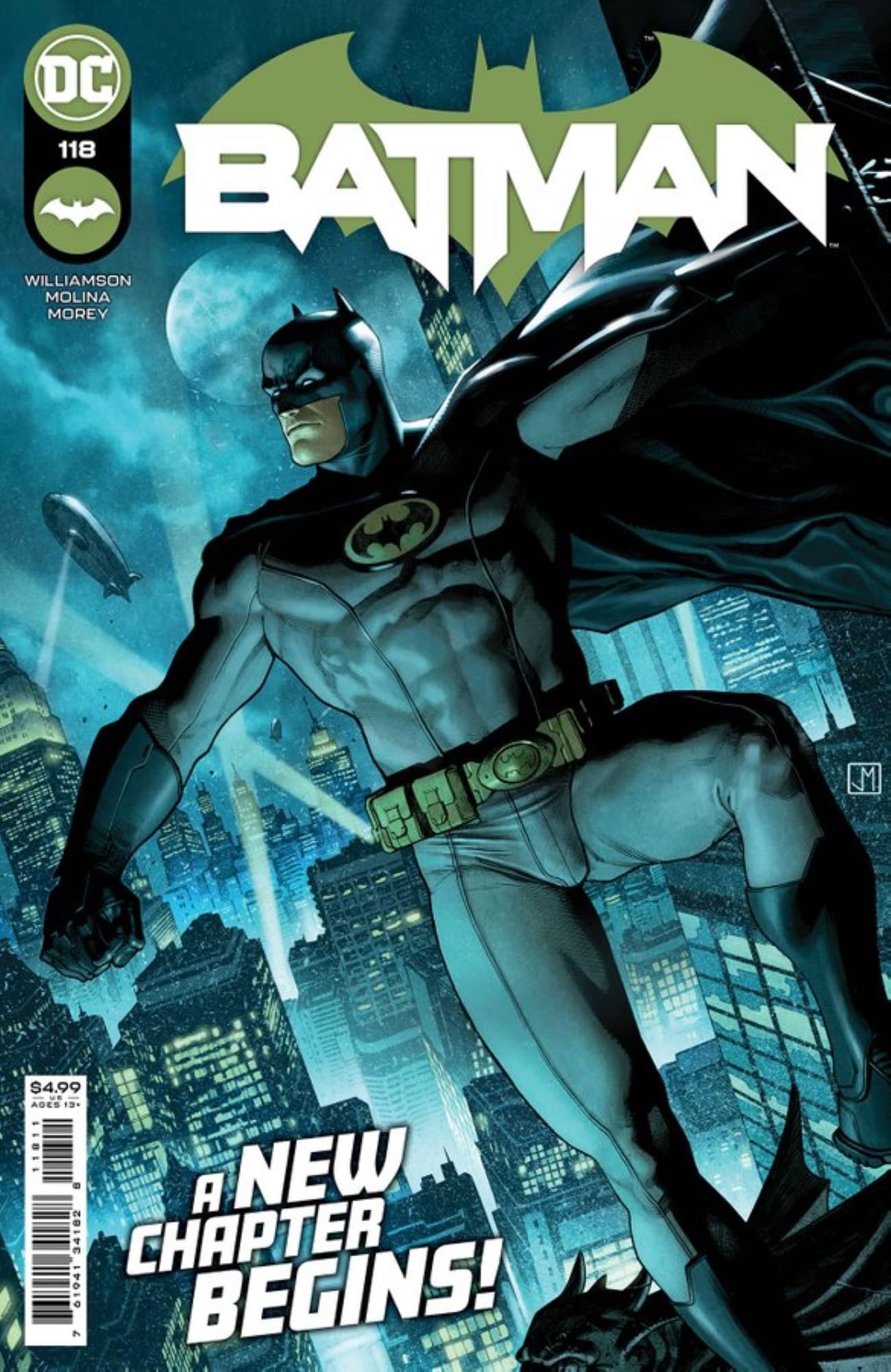
First cover appearance:
New writer. New artist. New story arc and a new villain called ABYSS!
First appearance:
First cover appearance:
Nice, I like Williamson’s indie stuff. He did good during the original Dark Nights Metal, but I haven’t kept up with his other hero books. Batman is a major title, so I’ll keep an eye out.
Not digging the yellow oval bat symbol. Nothing says “stealthy detective who strikes from the shadows” like a giant, neon yellow, middle of the chest logo.
Molina is drawing it, so thats a huge plus.
Looks like the Batman Inc. suit. Tomeu Morey still on colors, thank goodness. He takes everything to another level.
Tomeu Morey hands down best colorist. He made me pickup Heroes in Crisis lol
I would think the symbol is bulletproof and it is there to subliminally draw the attention of a would be shooter to aim at it, vice another part of his body like his heart or face.
I think making the symbol noticeable would strike fear into those he faces in the dark… I know I’d be running like F$CK if I was bad guy and saw that shit glowing on his chest in the dark…
Criminals are a superstitious cowardly lot…
not available on tfaw yet
Yeah its 4/5 months away. Issue 114 drops Oct
I always thought that Batman purposely put the yellow symbol on his chest as a target to distract criminals, or to try and keep bullets out of his exposed jaw. 
I’m pretty sure Batman gave that exact reason for the yellow somewhere. I just can’t remember what book it was (many years ago).
You are correct, this is the reason in canonical lore. However, it is also stated that the rest of his suit wasn’t bulletproof or had less armor in it. This feels like a hand-wavey way of explaining away the campy 60s & 70s design that didn’t jive with the “stalkikg from the shadows and striking fear into the hearts of criminals” motif that the character has.
Also, and I know this may he blasphemy, but I don’t like the blue cape, cowl, and boots. Batman is best when he is dark and brooding. Bright colors don’t convey that message.
I think the “striking fear into the hearts of criminals” ship has sailed. With the flurry of new baddies and the persistence of the old rogues, none of them seem particularly afraid of Batman.
He’s a much better character when portrayed as a detective, not an ass-kicker.
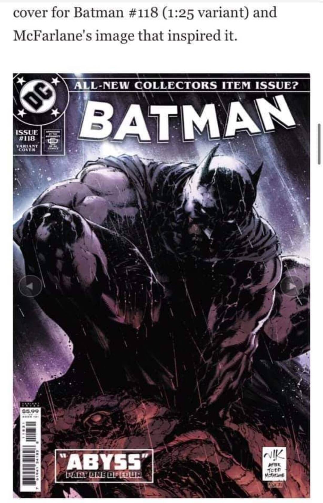
I haven’t been buying any ratio variants lately, I think the last one I bought was Batman 100. That being said, I’m all over this one!
I’m kind of surprised DC editorial approved a Marvel homage. I think people will be looking for this, though, and maybe DC knew that.
Well, McFarlane is pretty involved in DC right now, by way of DC Multiverse and DC Collectables. Perhaps that is why?