Keep buying cheap copies of Batman 24 still. Love that issue! I like the whole relationship story going back to Batman 14-15 “Rooftops” story! Tom King gets too much of a bad rap.
2 Likes
I do as well. What comic fan wouldn’t be reading Tom King on Batman? 

Honestly I am waiting for the issues to show up in $1 clearance sales. Except 3 & 4. Buying those.
1 Like

1 Like
Those ears tho.
1 Like
Taking it back to the beginning
All I see is a whole lot of locked knees.
And Bruce’s legs go for miles! Daaaaaayyyyyyyummmnnn
2 Likes
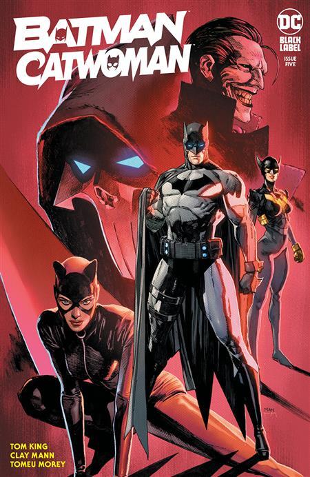
That’s a goddamn awful cover. That lady in the background looks like she has a stick up her ass. Or pregnant. Jesus the more I look at it the worse it gets. Explain why the shadows are going in completely different directions?
1 Like
Dramatic effect, or a rip in the time/space continuum that affects the physical properties of light. Or a strange arrangement of spotlights. Or bad art.
2 Likes
Yeah, I’m not following the story but when did Bruce lose his original legs and is the newest storyline that the new villain Miracle Molly is trying to get hers back from him?
It’s Tynion’s newest villain! Who is Pilate Dotty!? Why can’t Batman break her mesmerizing spell and quit lengthening, strengthening, and toning? Find out more in Batman Catwoman #5, “How Bruce Got His Curves Back!”
1 Like
LoL. That’s real?
No. I made it up and placed it in block quote format.
Batman has child-bearing hips.
Considering Batman is both on top of Catwoman’s leg but BEHIND her arm I’m more curious on when she grew and/or he shrunk. THAT’S a story I want to read!
2 Likes
Physicists call it a “Liefeld Shift.” When light in comic art seemingly glares from all directions leading to contradictory shadows and characters out of proportion with each other. Coined after its discoverer, Rob Liefeld who used this discovery to great fortune and fame.
4 Likes
Ok Let’s call this.
Cover sucks.
File it under worst covers of 2021, shall we?
It’s definitely among Mann’s weakest work. Looks rushed.
1 Like
I noticed that too… but it’s so bad, I couldn’t even bother typing up a comment here to talk about it…